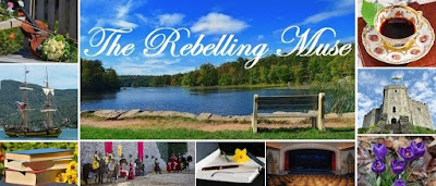
A New Header and Blog Look
1:54 AMHello all!
You may have noticed that there have been a few changes around here.
I decided to update my blog look again. Not that I was really tired of the old look, but I had changed the width of the sidebar months ago and the lopsided banner finally got to me.
And the background picture really needed to change from spring to summer - so I changed it to a dusky beach sunset, which I think looks really pretty. With that, all the text colors got changed to match the picture. I dearly love the colors in here - that shade of purple is one of my favorite shades ever.
 |
| The Old Header |
In my previous headers, I put in pictures that reflected my interests. In Header 3, which you can see above, I started mixing in pictures pertaining to my WIPs.
This time around, I decided to try out Canva after MK successfully made a custom banner through them for her blog. The templates were crazy complicated and hard to distinguish, but I decided to go with a 9 grid one - similar in structure to Header 2.
To change it up, I decided to put one picture for each of my WIPs with a title pic in the middle.
 |
| The New Header |
Chandelier - "Shattered Chandelier". Since this work is POTO inspired, I decided to use the chandelier as the symbol for this WIP.
Apples - Hidden Seeds. Since the apple is a main symbol of this WIP, I decided to find some really colorful ones.
Cave - From the Cave. This one was really hard to find a picture for. Caves aren't exactly horizontal...
White rose bush - The White Rose. Easy right?
Steamship - "Rose of Culmore". Trying to find an Irish symbol that fit in the horizontal box was really hard. So, I decided to go with an immigrant symbol of the steamship - since this is an immigrant story.
Holsteins - Plain and Simple Truth. Since free Amish pictures are scarce, I decided to go with the classic dairy cow for this farming WIP.
Church - Ancora Spei. Since this one is the most religious of all, I wanted a classic religious symbol. So I went with a Gothic church interior with stained glass windows.
Ship ropes - Fair Winds. I decided against the pirate flag even though it is a pirate story and decided to go with the ship instead....you know to keep it consistent with the other headers.
Having a fully stretched header makes me feel so much better! And it's so pretty :)
And now, I'd better head off to bed....after all, it's nearly 2 am....
Scribbingly yours,
Catherine


12 comments
Love that you used pictures to represent your WIPs. Also, you're writing an Amish story? If you ever want to know anything, we used to live with them ;p
ReplyDeleteketurahskorner.blogspot.com
Eeeeep it's so pretty!!!I love it immensely, m'dear. So very elegant.
ReplyDeleteOoh, so pretty!! <3
ReplyDeleteI feel super proud of infecting another person with Canva (you can also make book covers and stuff)
ReplyDeleteOH MY WORD! IT. IS. SO. CHIC.
I love the idea of using your WIPS! So smart!
I love the new look! It's so pretty! And the header! So cool that you used pictures for each of your WIPs!
ReplyDeleteAs soon as I saw it I knew The White Rose and Fair Winds pics. :) It looks so, so, so great!!!
ReplyDeleteCatherine... using pictures from your WIPs in the header is such a good idea! It looks beautiful! :D
ReplyDelete<3 <3 <3
ReplyDeleteLove your new header and background!! I also love how all the pictures relate to your writings. :)
ReplyDelete~Gianna
starlitsea.wordpress.com
Your writing something inspired by POTO!
ReplyDeleteThat's awesome.
It is quite lovely - and so few people appreciate what good aesthetics really do for a thing.
ReplyDeleteYour new blog look looks awesome, Catherine!
ReplyDelete-Quinley